柱状图信息稀碎,如何抓取"特点"
雅思小作文里,柱状图 + 多年份 + 类别复杂 = 地狱难度 👹 信息碎得像撒了一地的拼图,极值不极端,趋势不明显,overview 无从下手。
别慌!我们一起来拆解一个高难度例题,看看如何抓到"特点",写出考官想要的 overview。
📌 先复习一下小作文的结构
- 第 1 段:改写题目(Introduction)
- 第 2 段:✅ 概述段(Overview)—— 最重要
- 第 3–4 段:分类细节描述(Details)
📌 题目如下(👉 点击查看原题)
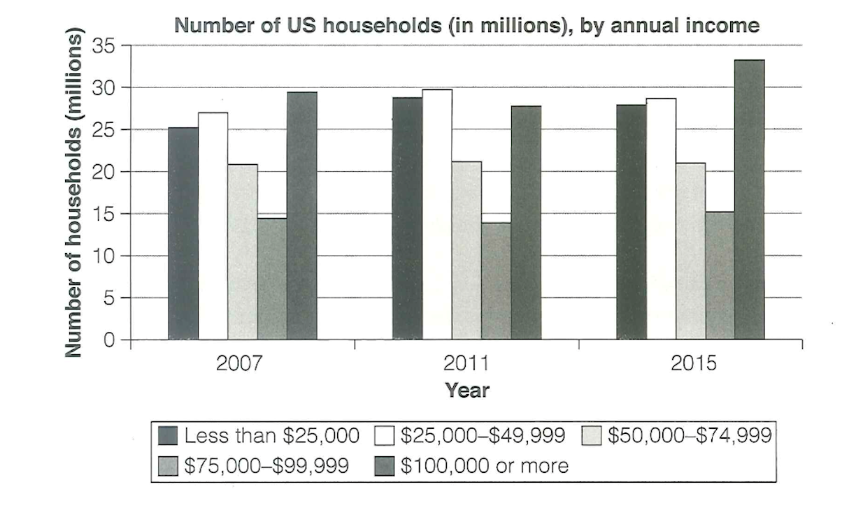
The chart below shows the number of households in the US by their annual income in 2007, 2011 and 2015. Summarize the information by selecting and reporting the main features, and make comparisons where relevant.
第一段:改写题目
题目原文: The chart shows the number of US households by annual income in 2007, 2011, 2015.
📝 改写: The bar chart illustrates the distribution of American households across five income brackets for the years 2007, 2011, and 2015.
第二段:概述特点
📌 考官想看到的是:根据变化趋势的分组 + 整体分布特征,而不是把 15 个数字依次报一遍。
3 年 × 5 组,15 根柱子,怎么找特点?
✅ 两步走!
1️⃣ 横向观察:每组收入在三年间的走势,把相同变化的归在一组
| 收入分组 | 2007年 → 2011年 | 2011年 → 2015年 |
|---|---|---|
| 低收入组(第 1、2 柱):先升后降 | 📈 | 📉 |
| 中收入组(第 3 柱):没变化 | — | — |
| 高收入组(第 4、5 柱):先降后升 | 📉 | 📈 |
2️⃣ 纵向观察:比较不同收入组
- 2007 年:两头高 📈📈 + 中间低 📉
- 高收入与低收入家庭数量变动明显,中等收入家庭数稳定。
- 2011 年和 2015 年亦是如此。
✅ 根据以上观察和分析,概述段(Overview)这样写:
Overall, the number of lower-income groups increased then decreased, while higher-income groups showed the opposite trend, rising then falling back. The most notable change was that the highest-earning bracket overtook the lowest-earning bracket by 2015. Meanwhile, the middle-income group remained stable throughout.
第三段:细节描述【2 组高收入】
先降后升,数量差距大。
The number of households earning over $100,000 fell slightly from 29 million in 2007 to 27 million in 2011, then rose considerably to 34 million in 2015, the highest figure over the given period. The second-highest bracket ($75,000–$99,999), which contained around 14 million households in 2007, also dropped marginally in 2011, then rose to reach its peak of 15 million by 2015.
第四段:细节描述【2 组低收入 + 1 组中收入】
- 【低收入组】先升后降,升降幅度都不大,"携手共进退"。
- 【中收入组】没变化,简要描述,也放在这段。
In contrast, the two lowest brackets both grew between 2007 and 2011 — from 25 to 28 million and from 27 to nearly 30 million respectively. They fell back, though remaining above their original levels in 2007. Meanwhile, households earning between $50,000 and $74,999 stayed consistently at approximately 21 million through these years.
💡 小结
柱状图信息散乱无章不可怕,记住 横向看变化 + 纵向看分布,特点自然浮出来。
附:完整例文(179 words)
The bar chart compares the number of American households in five annual income brackets for the years 2007, 2011, and 2015.
Overall, the number of lower-income groups increased then decreased, while higher-income groups showed the opposite trend, rising then falling back. The most notable change was that the highest-earning bracket overtook the lowest-earning bracket by 2015. Meanwhile, the middle-income group remained stable throughout.
The number of households earning over $100,000 fell slightly from 29 million in 2007 to 27 million in 2011, then rose considerably to 34 million in 2015, the highest figure over the given period. The second-highest bracket ($75,000–$99,999), which contained around 14 million households in 2007, also dropped marginally in 2011, then rose to reach its peak of 15 million by 2015.
In contrast, the two lowest brackets both grew between 2007 and 2011 — from 25 to 28 million and from 27 to nearly 30 million respectively. They fell back, though remaining above their original levels in 2007. Meanwhile, households earning between $50,000 and $74,999 stayed consistently at approximately 21 million across all three years.